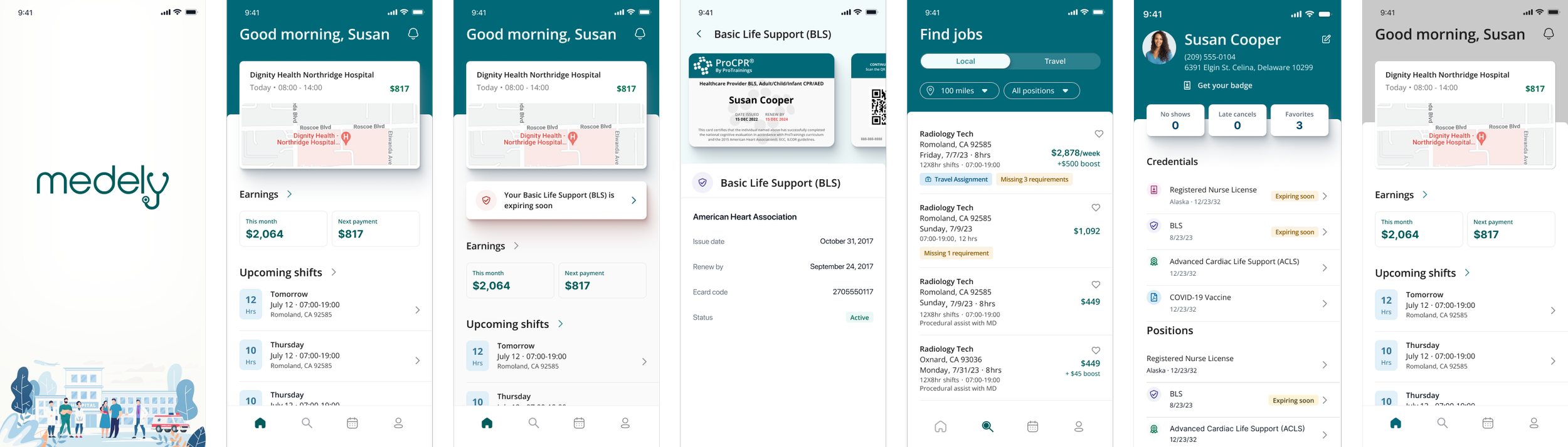
Medely Mobile visual identity

Problem
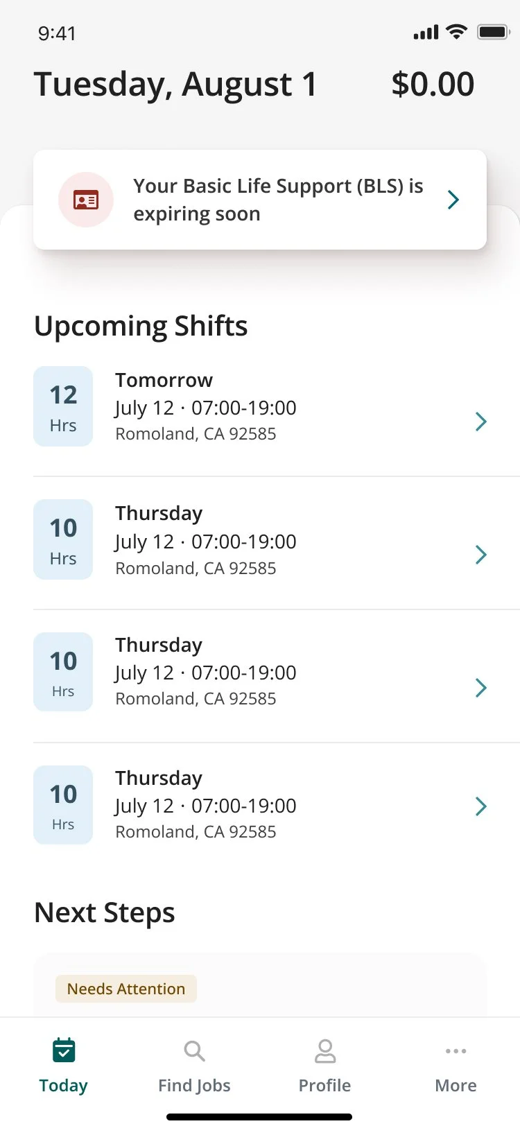
With the mobile app launch, Medely wanted a product that could be celebrated in the app store and aligned with the Medely brand that our professionals love to use. While functional, the current mobile web solution lacked consistency and intentionality regarding typography, color, and elevation and lacked Medely’s unique personality.
Business Objective
Six months from now, 80% of Pros use the native app exclusively.
Goals
Develop a unique visual identity to differentiate the product from competitors.
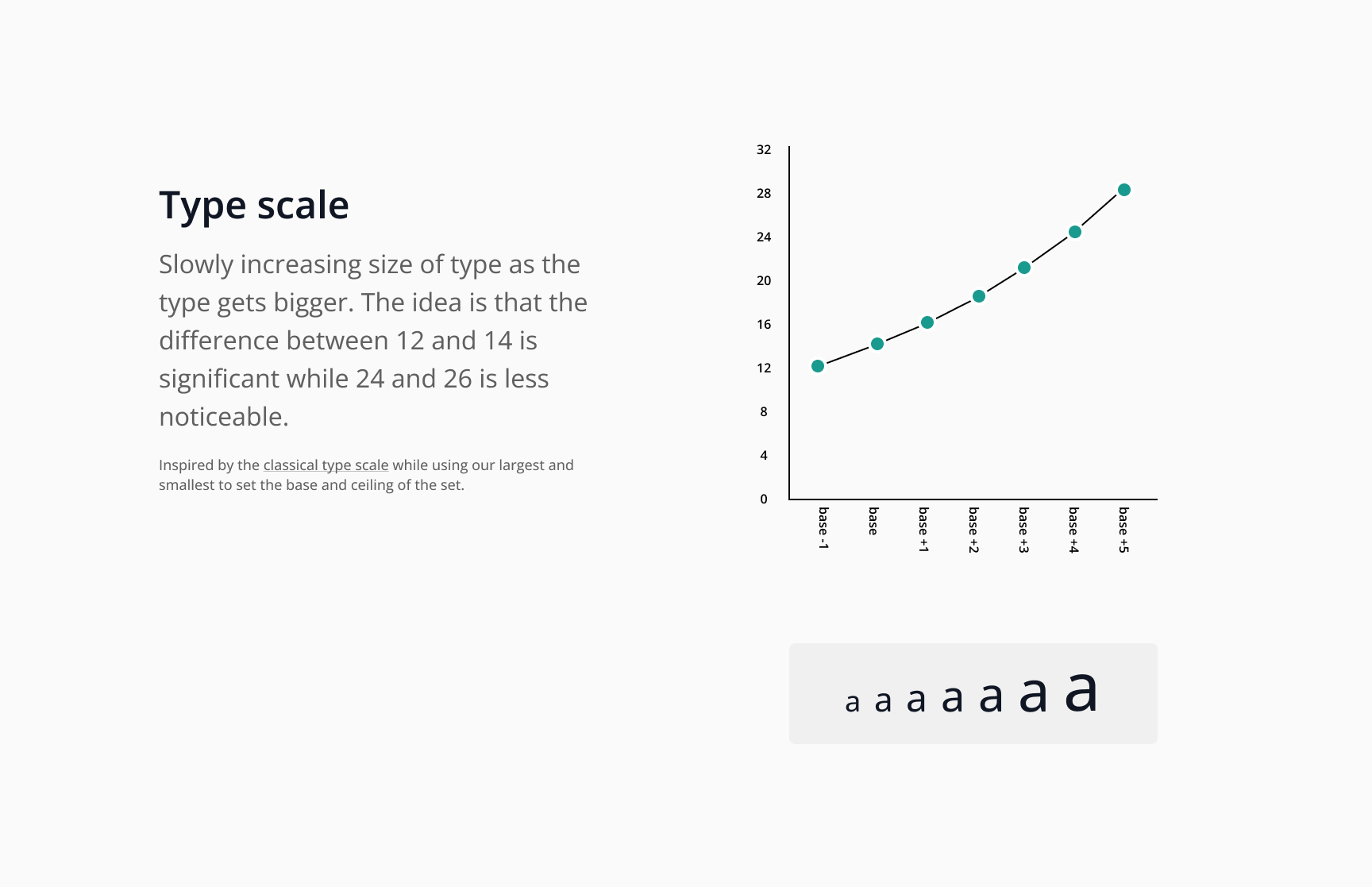
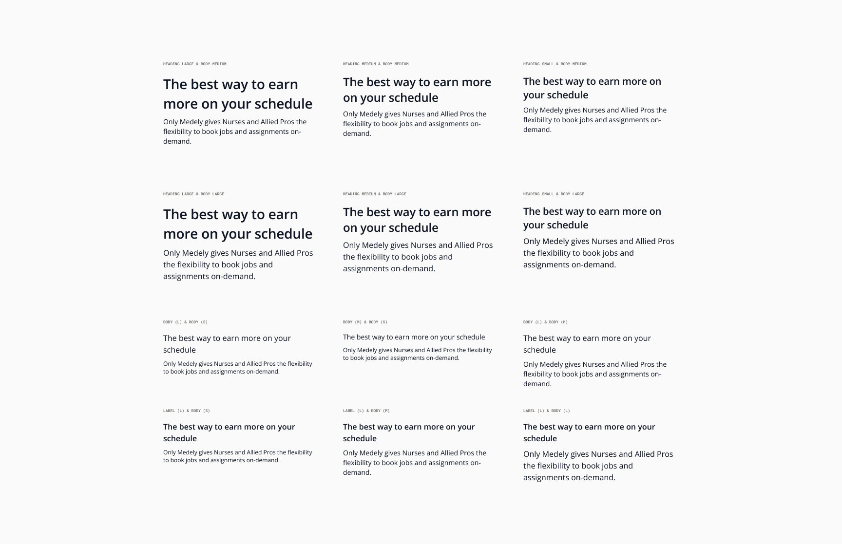
Standardize typography and color usage across web and mobile platforms.
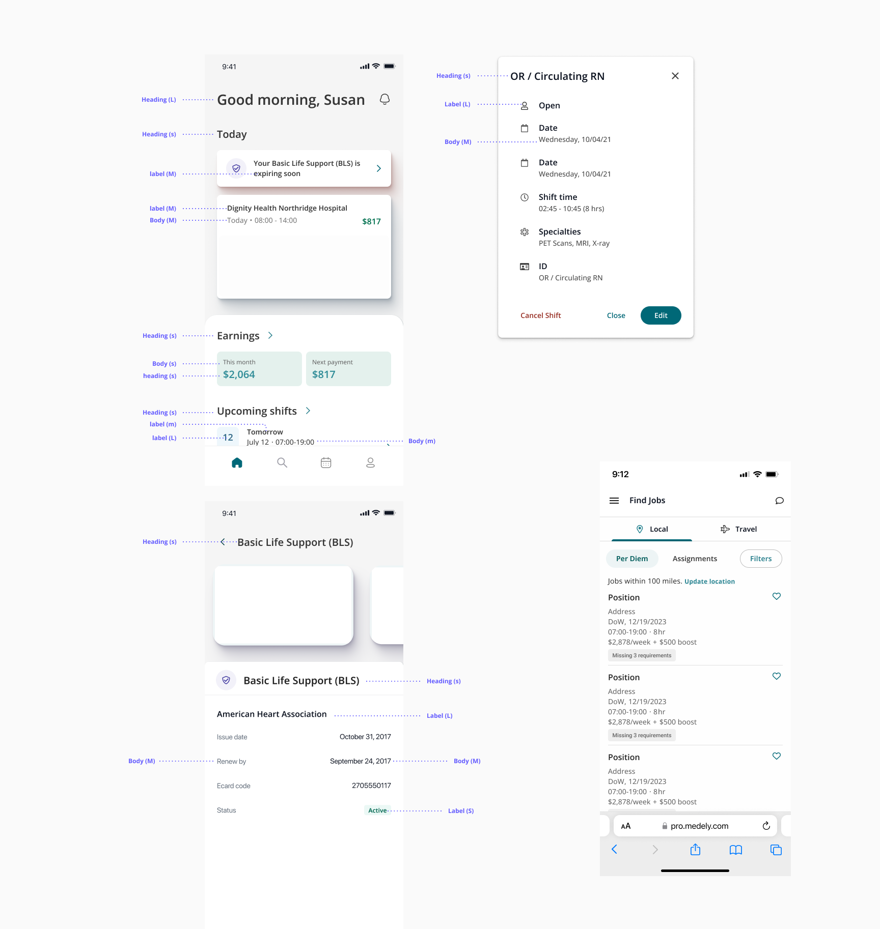
Establish consistent patterns for visual hierarchy, reducing design and tech debt due to a growing team without standards.
Explorations
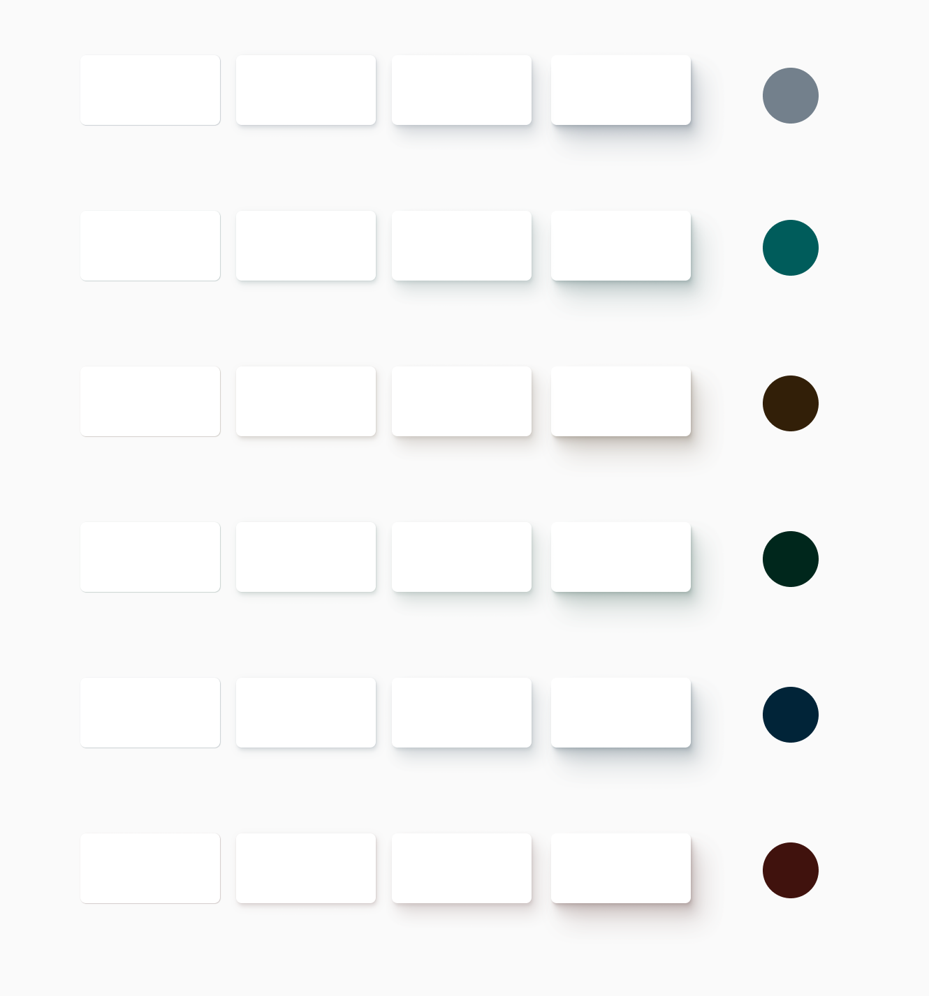
What if the state of elements on a screen was communicated through shadow


Results
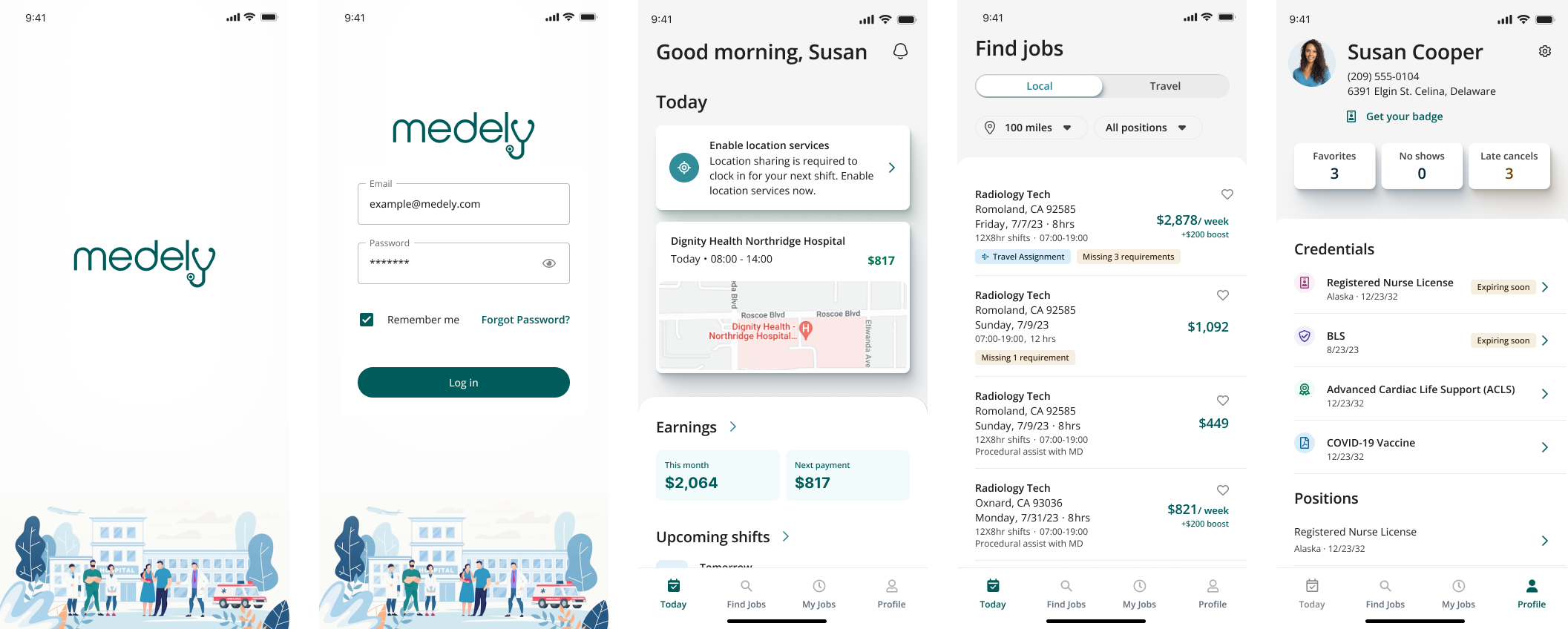
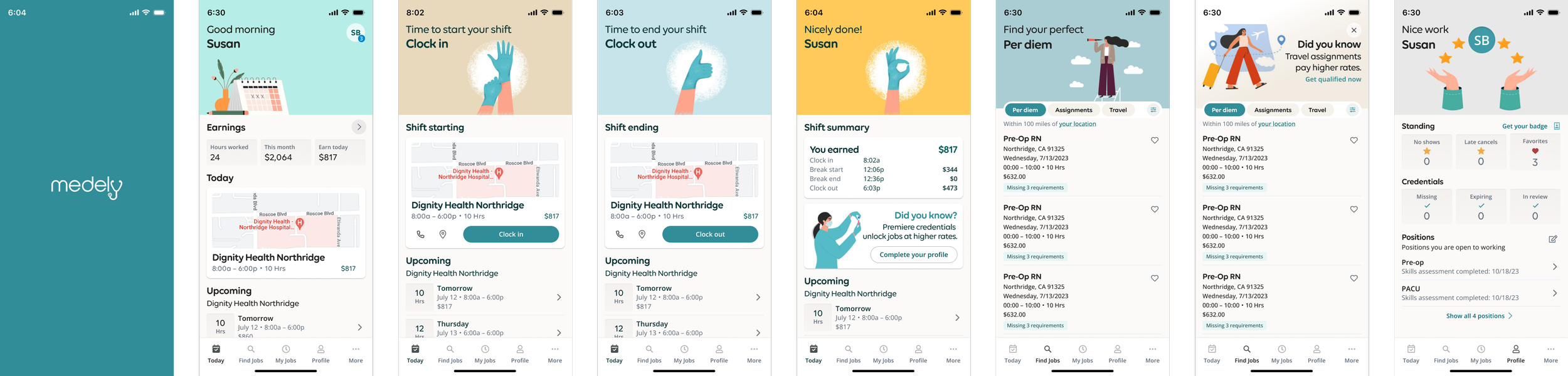
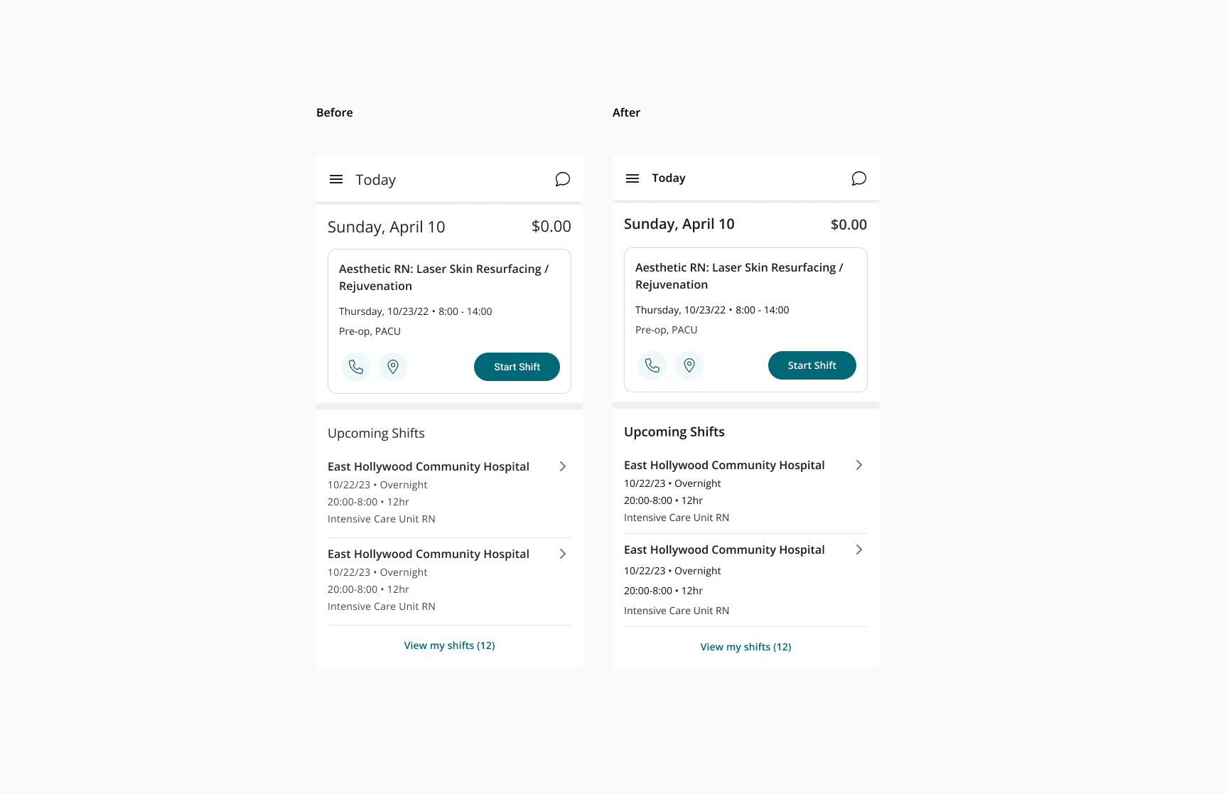
Brand new visual design for the mobile app without significantly increasing the scope.
The app is currently launching and in beta.
Users are all responding very positively to the new look and feel.
